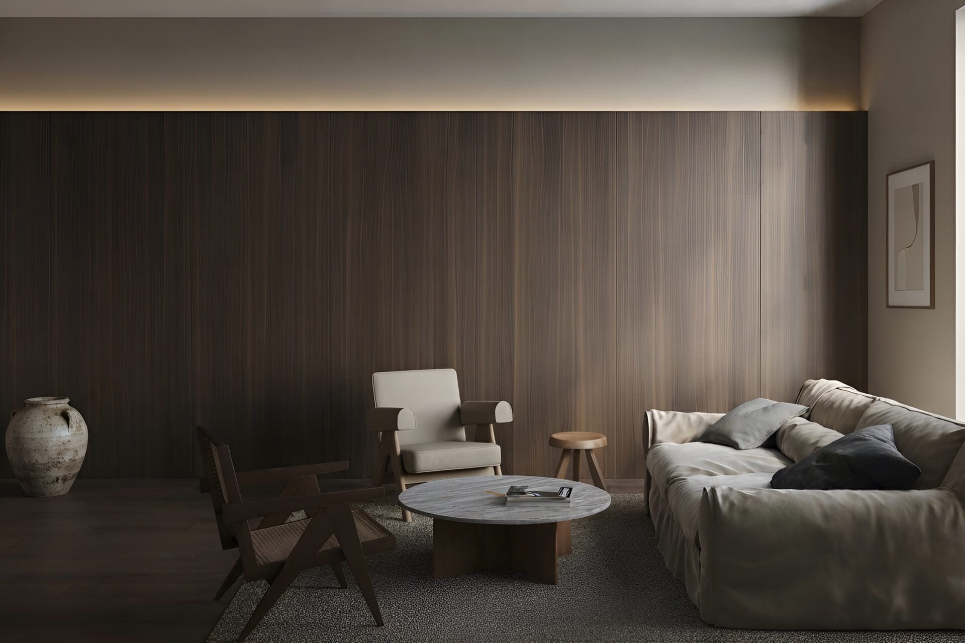

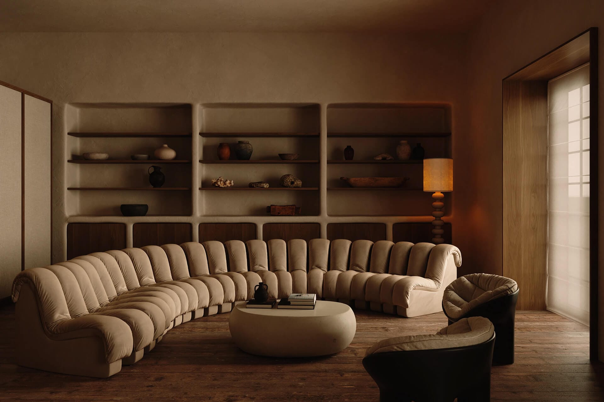
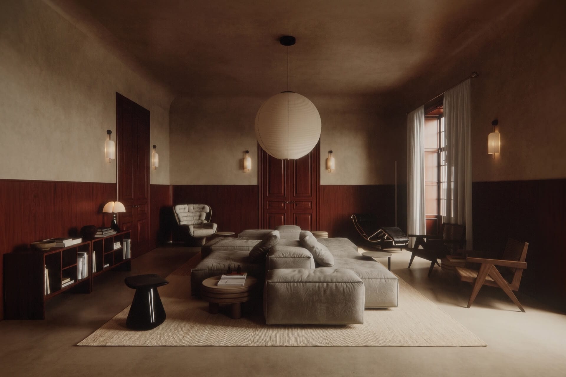
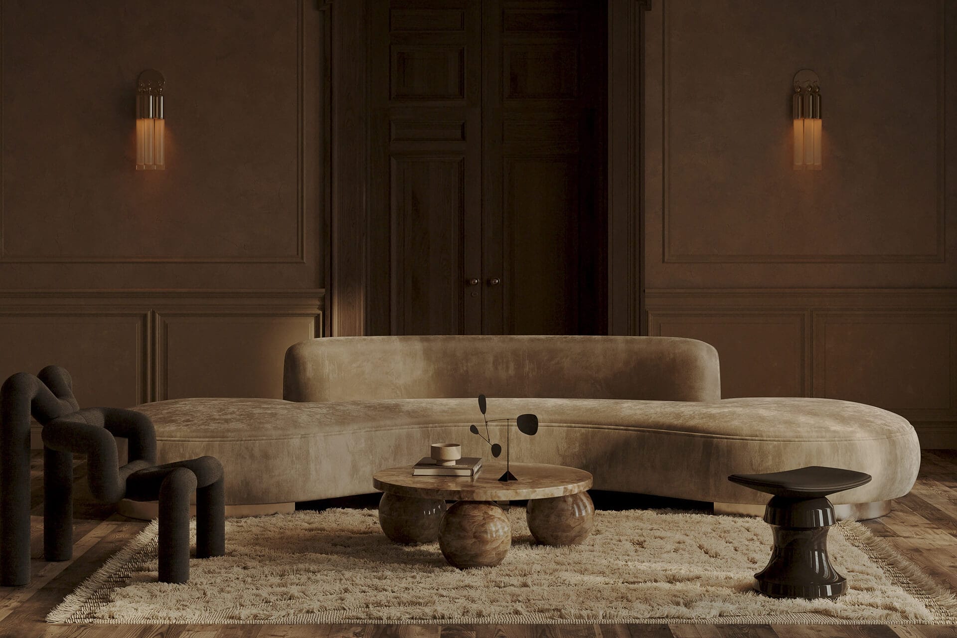
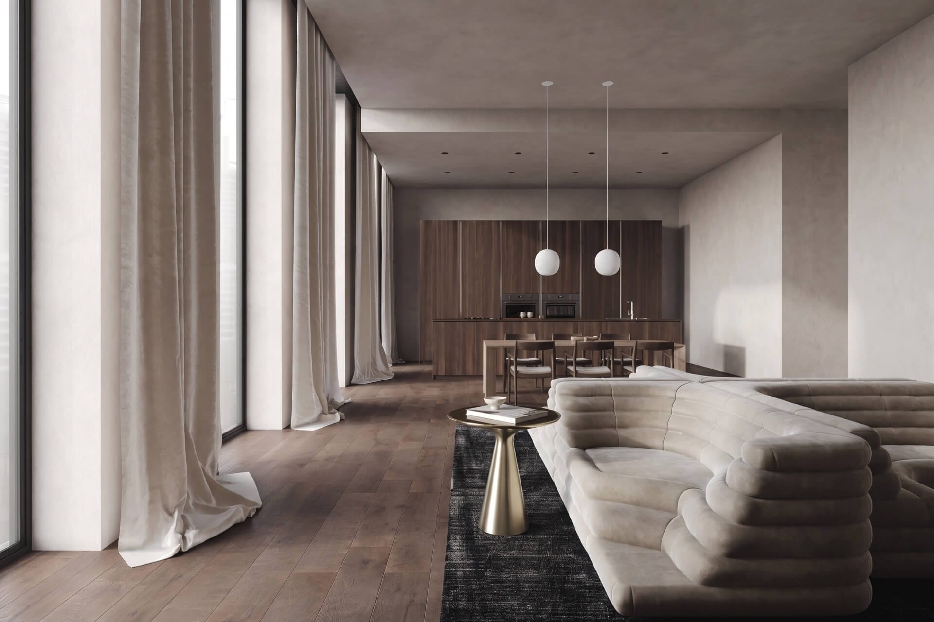
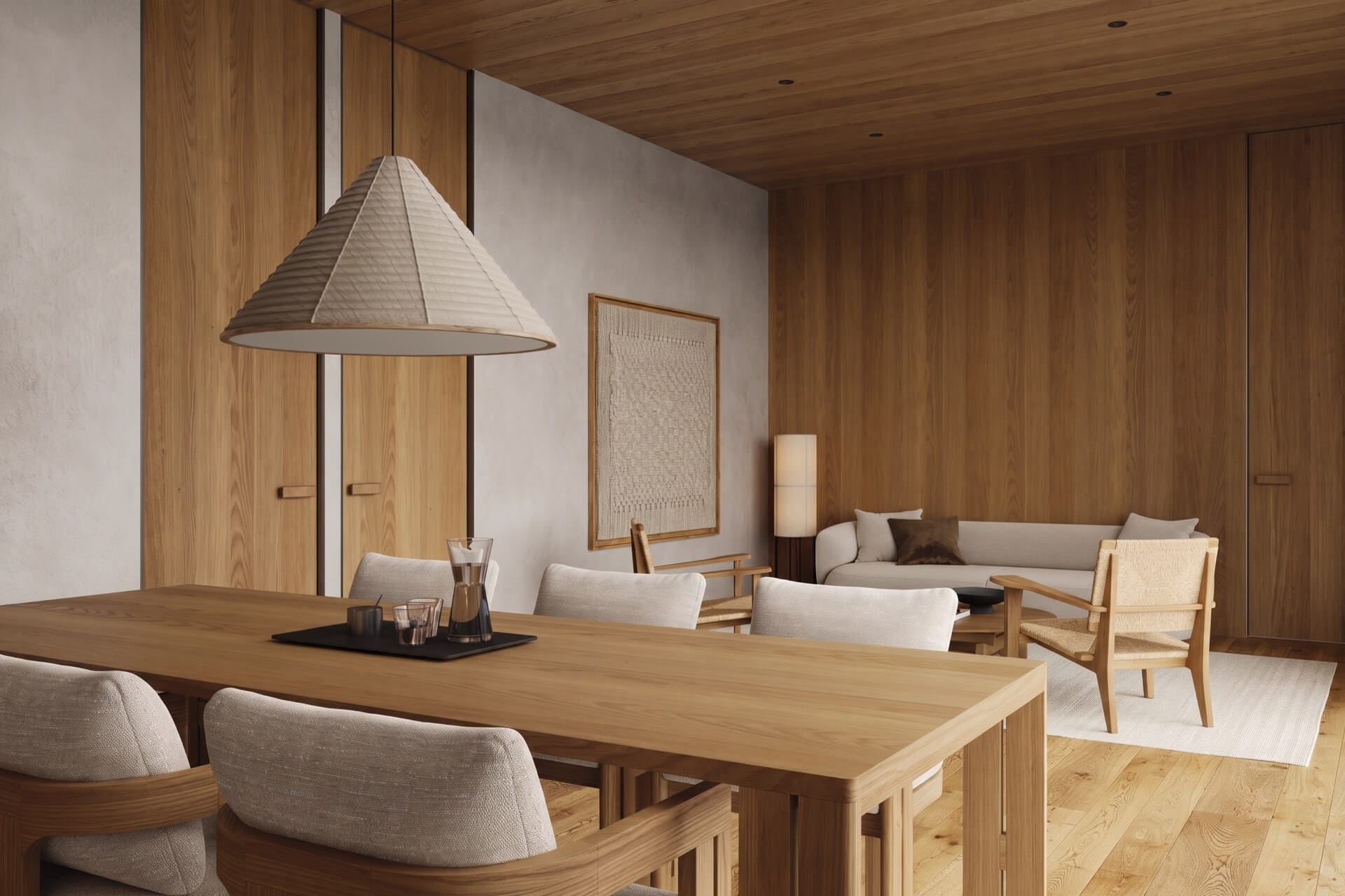
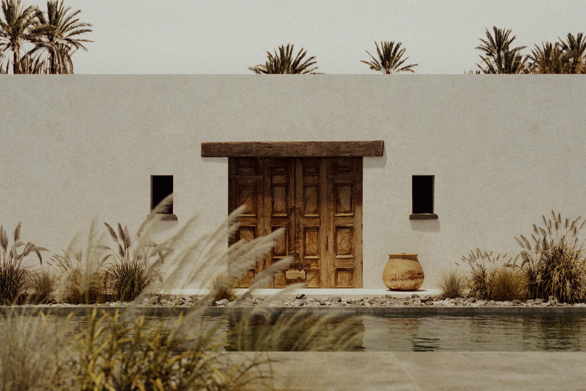
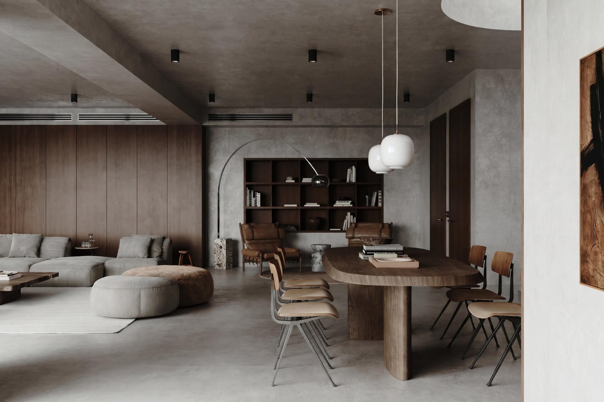
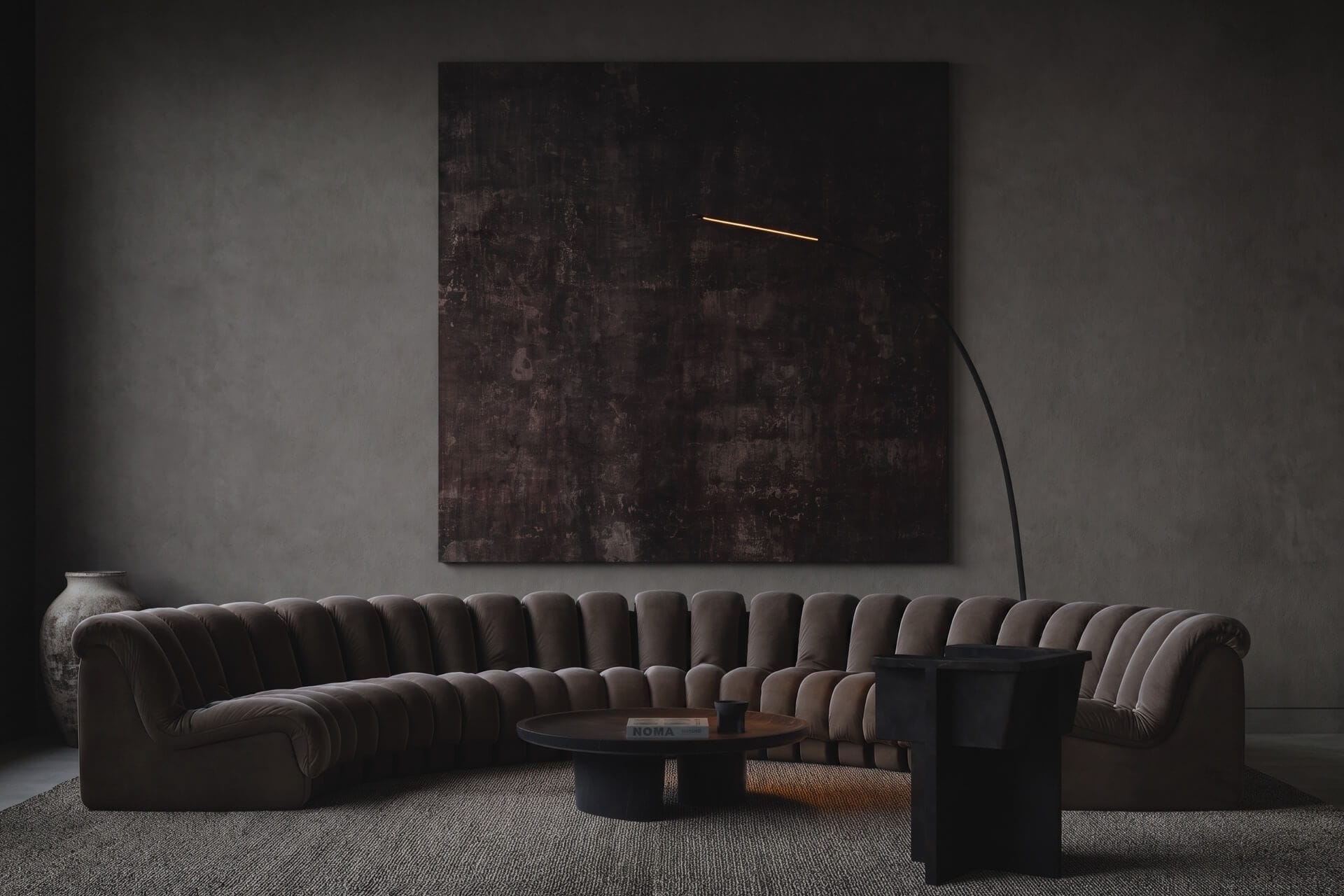
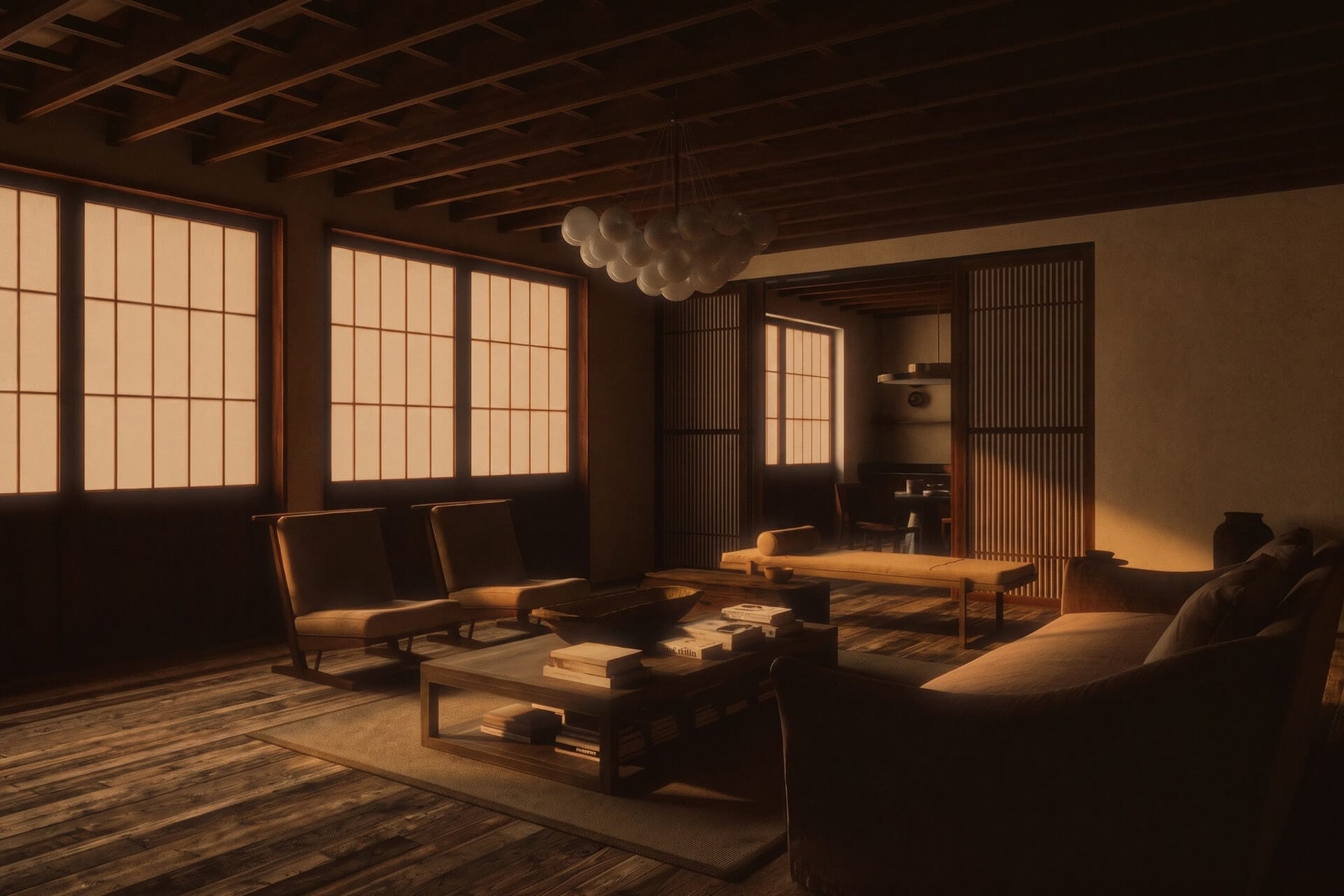

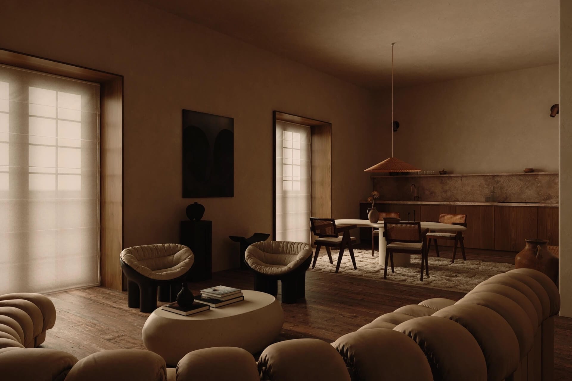

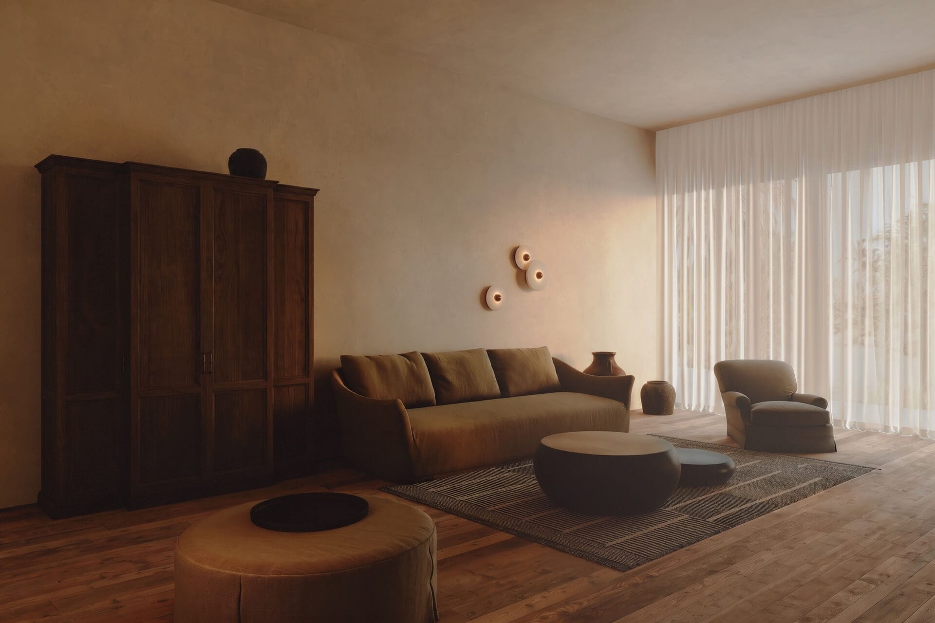
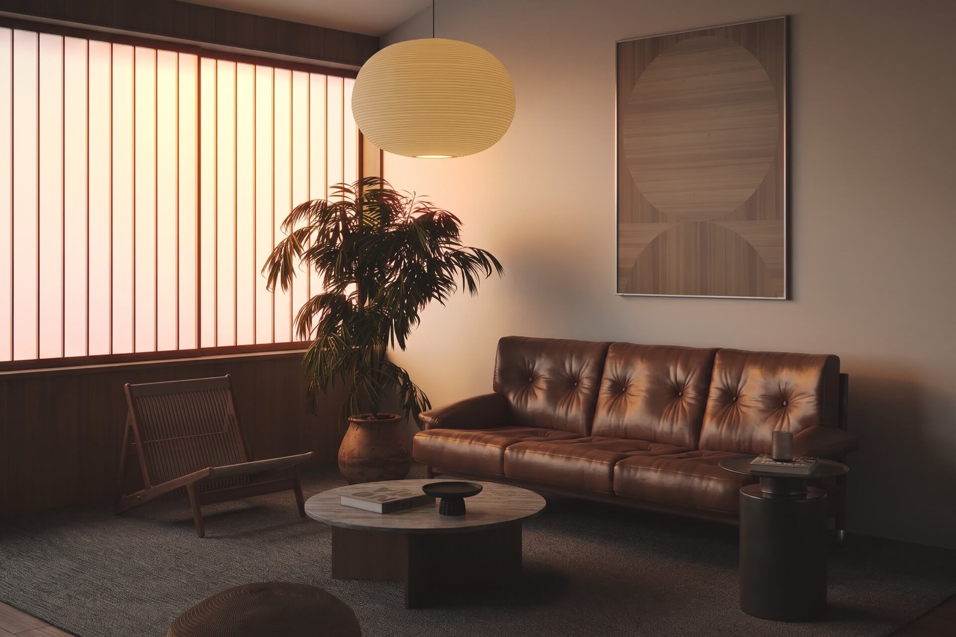
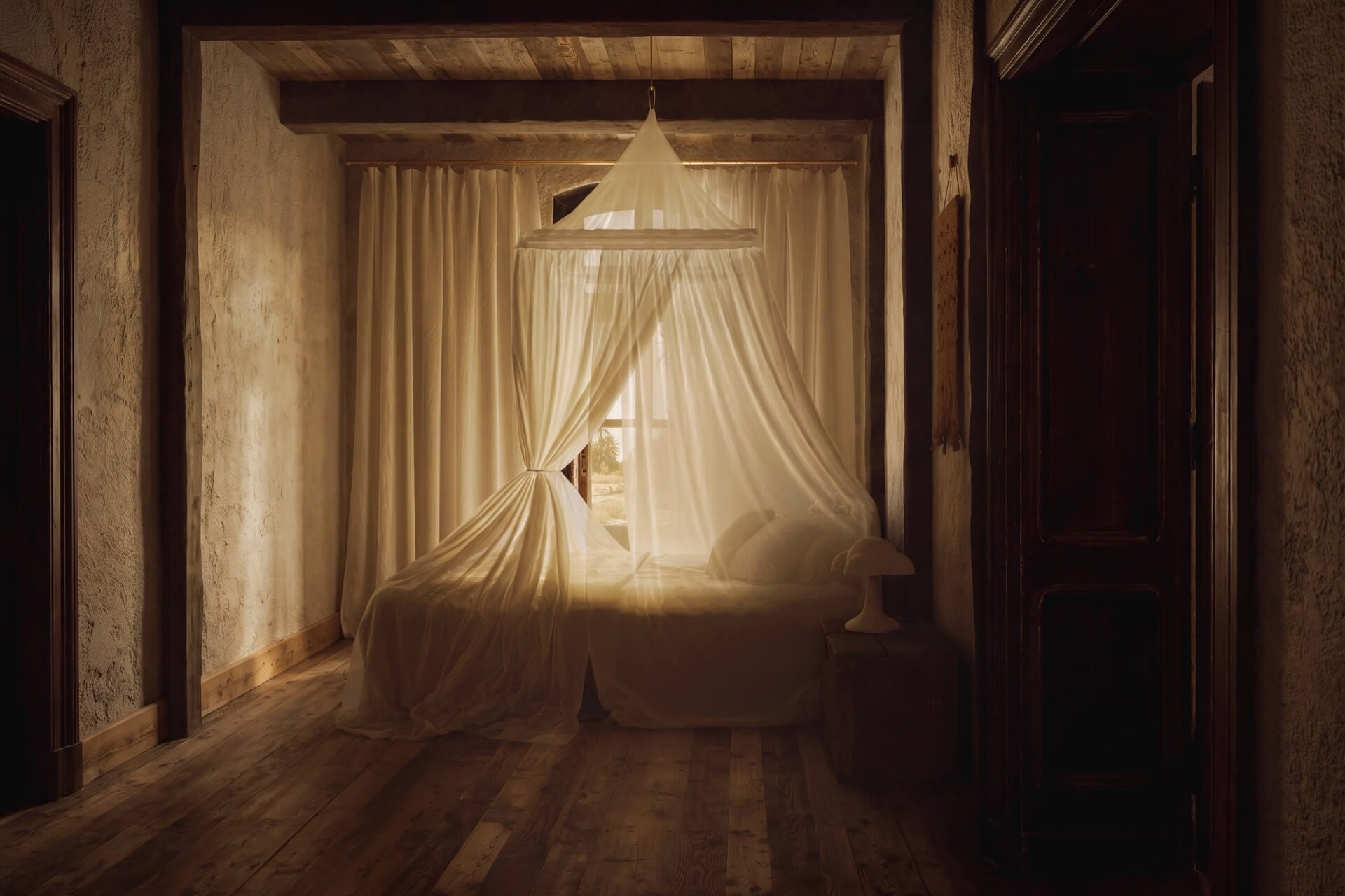
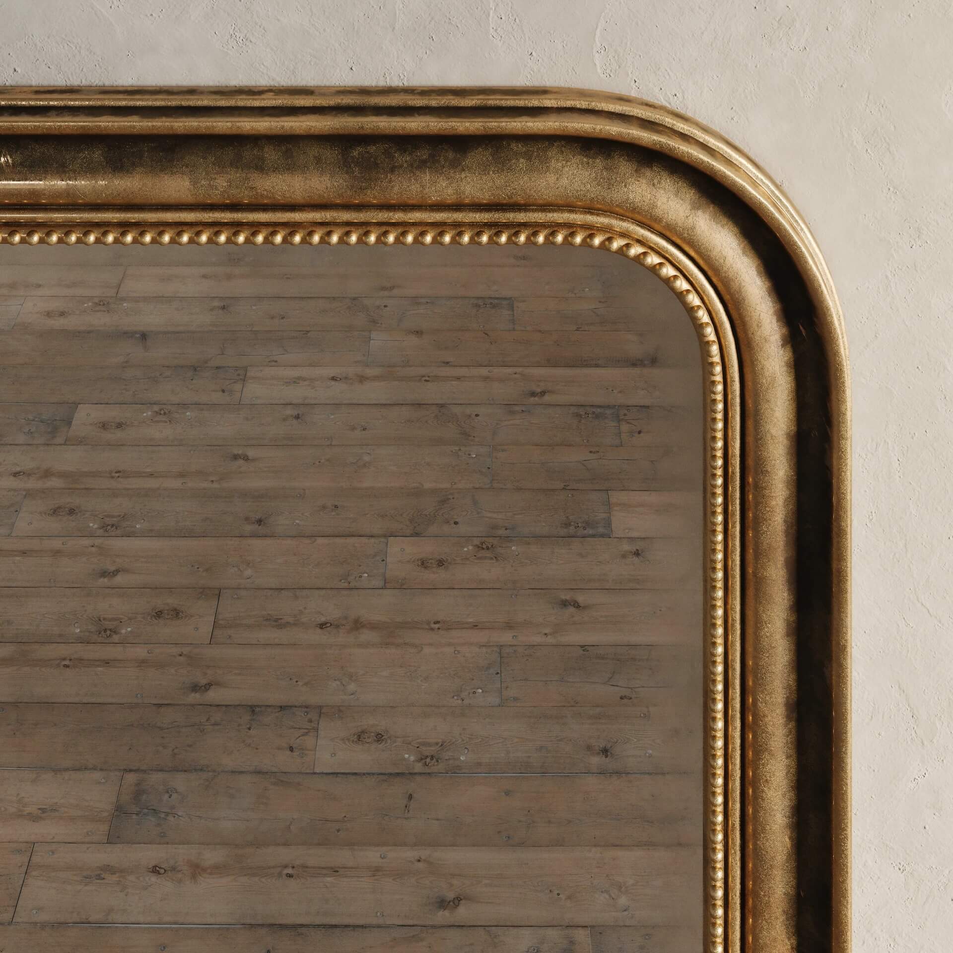
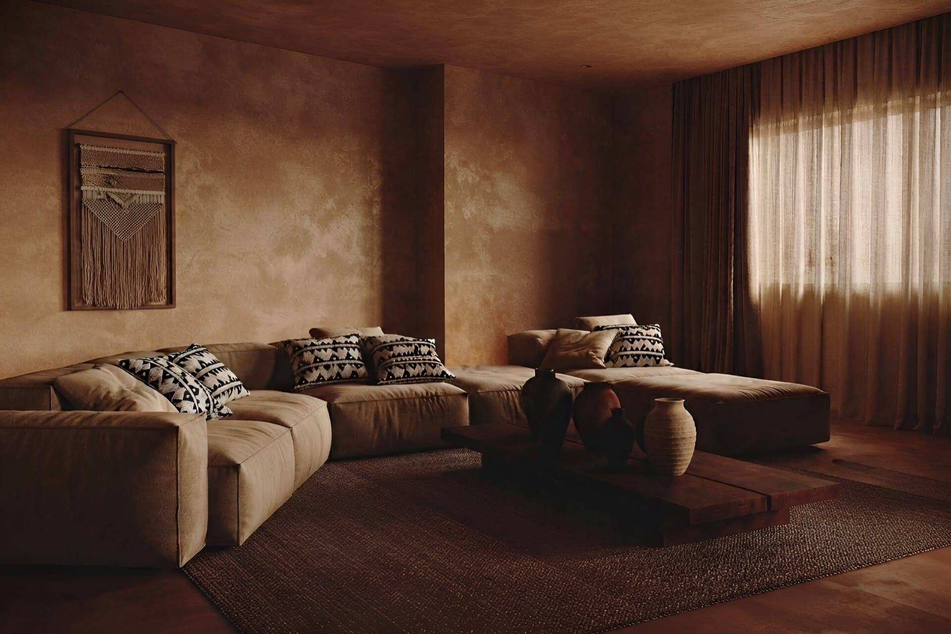
Working in one colour is not restraint, it is exposure. Remove contrast and every remaining decision — the weight of a fabric, the depth of a plaster, the exact warmth of a stain — has to carry the room by itself. There is nowhere to hide a mistake.
A bedroom in tobacco, umber and clay has no accent to rescue it. If the throw is a shade too orange, the whole room reads as fancy dress. If the plaster is a shade too grey, the timber goes green. The tolerances are brutal and they are all invisible on a mood board.
The trick, insofar as there is one, is to vary the texture instead of the hue. Heavy wool, dry clay plaster, oiled dark timber and a raffia basket can all sit within a few degrees of one another on the colour wheel and still produce a room with depth — because the light behaves differently on each of them. Matte absorbs, oil reflects, weave scatters.
Get that right and a monochrome room has more range than a colourful one. Get it wrong and you have a very expensive brown box.